
Singapore Airlines API Wesbite Redesign
Scroll ↓
The Product
KrisConnect is Singapore Airline’s platform to provide clients with the ability to implement features like flight bookings, flight information/status, check in, meal and seat selection functionalities on their own websites. With the redesign they aim to improve their ease-of-use so that both technical and non-technical users understand the products they offer and how they are beneficial. For developers specifically, they want to establish an easy to follow, step-by-step process so that they are able to export these features onto their own websites seamlessly.
The Problem
Even though Singapore Airlines is one of the world's leading airlines, they found themselves struggling to convert customers because typical users were being forced to use customer care as the uses of the various APIs were getting lost in the abundant amount of documentation, which was only relevant to certain people who landed on the site. The main purpose of the redesign was to reorganize and regroup information to make navigation easy.
Responsibilities
Preparations for user interviews, conducting competitive analysis, creating personas, journey maps, storyboards, information architecture, creating lo-fi wireframes and a high fidelity for the landing page.
My Role: UX Designer Duration: 3 months Software Used: Miro, Adobe XD
Understanding the Market
Since the API space was relatively new to me, I started out by doing some market research to understand what was already out there and what a typical website in this area looked like.
I looked at API websites belonging to other airlines as well as unrelated fields like banking to get a grasp of the features that were offered and how they compared to what Singapore Airlines had at the time.
One thing that was made abundantly clear during my competitive analysis, was the usage of client stories in order to communicate the use and advantages of the APIs and the segmentation of the information relevant to developers away from the rest of the API descriptions in order to avoid confusion and cluttering.

User Research
Since there was an existing site to work with, I immediately took to preparing for a usability study in order to clearly weed out and define the problem areas. We not only recruited prospective users (employees at travel companies and agencies) but also
took advantage of the existing user base for participants. I drafted four tasks that they would complete during the study; these included creating an account, browsing through APIs to choose a couple that they felt would be valuable to their business, request pricing or contacting customer care
regarding a query and accessing the support pages. Since there was a mix of developers and more business-focused users, we devised an additional task specifically for developers; to test any API in the sandbox. These were some of our findings from this study:

Based on the results of our study, I created personas: one for each category of user (business-focused and developer) in order to make sure that their needs, motivations and goals were kept in mind as we began our brainstorming process.
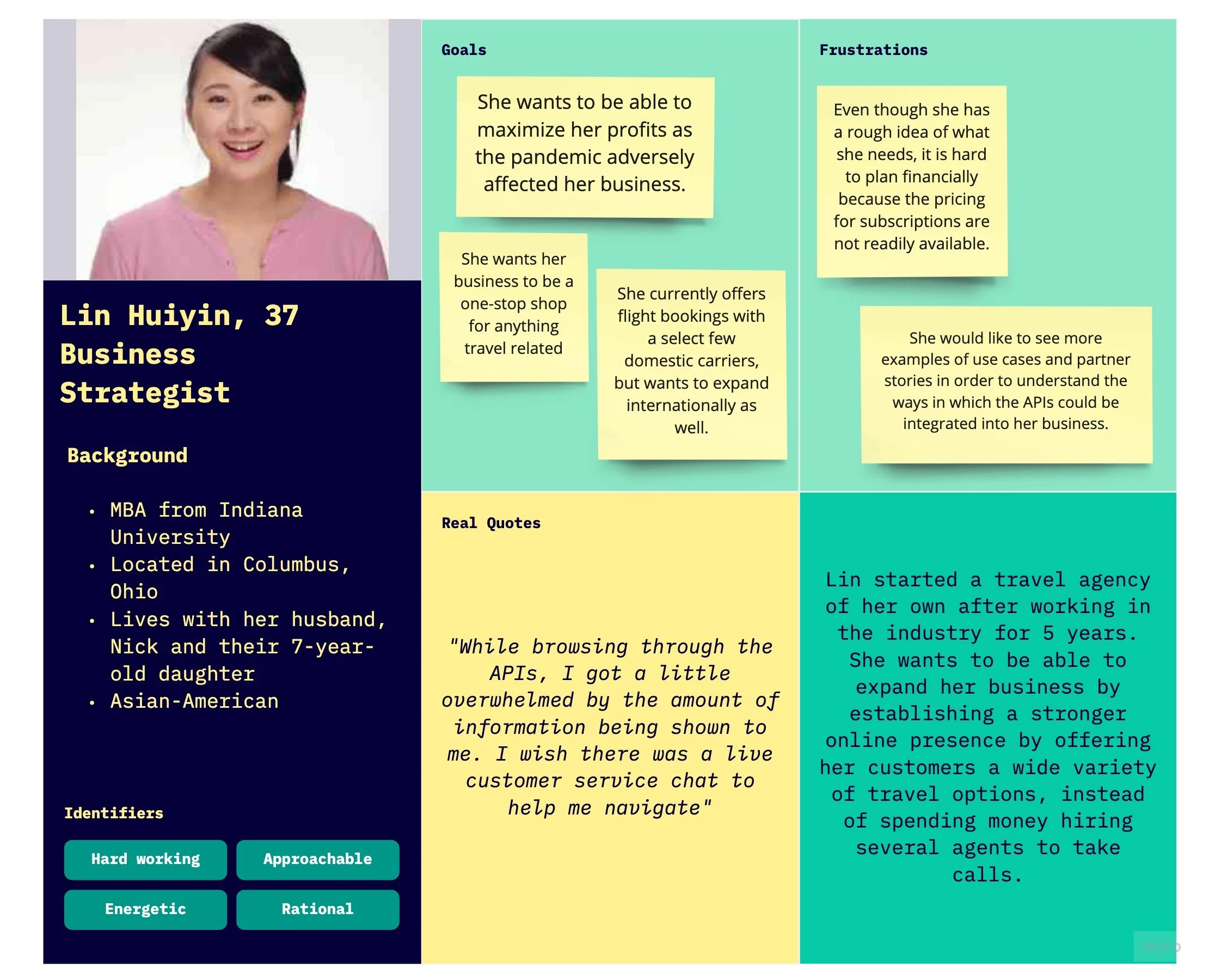

After the personas were made, I moved on to storyboarding. I chose to encapsulate the typical journey of one of our personas, Lin, based on what I had seen during the user interview phase. I did this because storyboarding helps to visually describe a user’s interaction with the product, tying together the research and the personas to highlight the areas of improvement as well as the needs of our target audience. Both the personas and the storyboard became a frequent point of reference as we started the design stage.


Breaking it Down
Since one of the main problem areas that came up during the interviews was the organization of the pages, I thought it would be helpful to create a site map. Our participants were also struggling with navigating the site while some were unable to understand some of the menu categories, and were unsure of where they needed to click to access the information they wanted. I thought that I would do away with the differentiation that was originally made between “closed” or paid and “open” or unpaid APIs, by simply
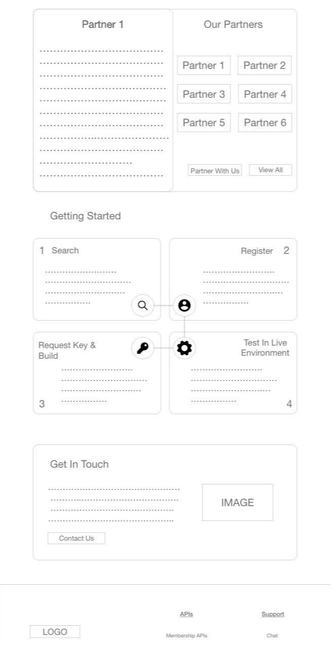
indicating to the user on each specific API page, whether a purchase was required. I also found that there was information that was repeated on several pages of the website, and removed them. I introduced a “Resource” tab so that developers could quickly get help as and when needed. I also created a separate tab for “Partner Stories” instead of having it hidden in the “About” section because it seemed to be a page that was valued by all kinds of users, but was hard to find.

Designing a Solution
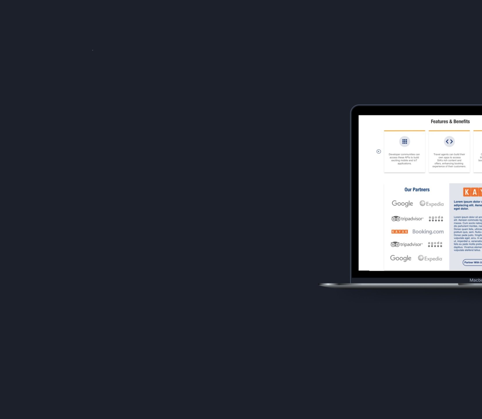
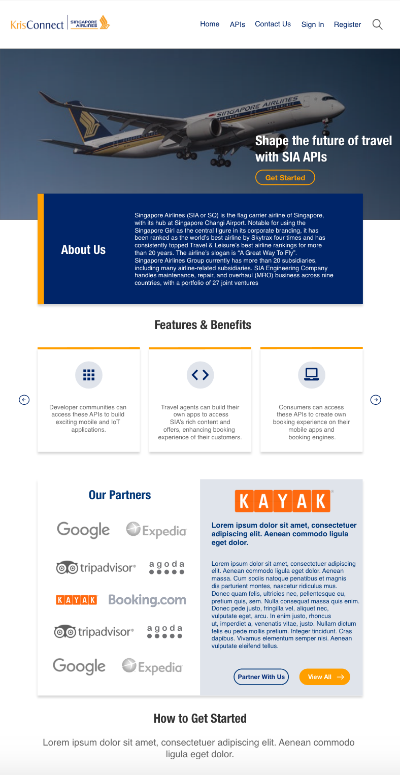
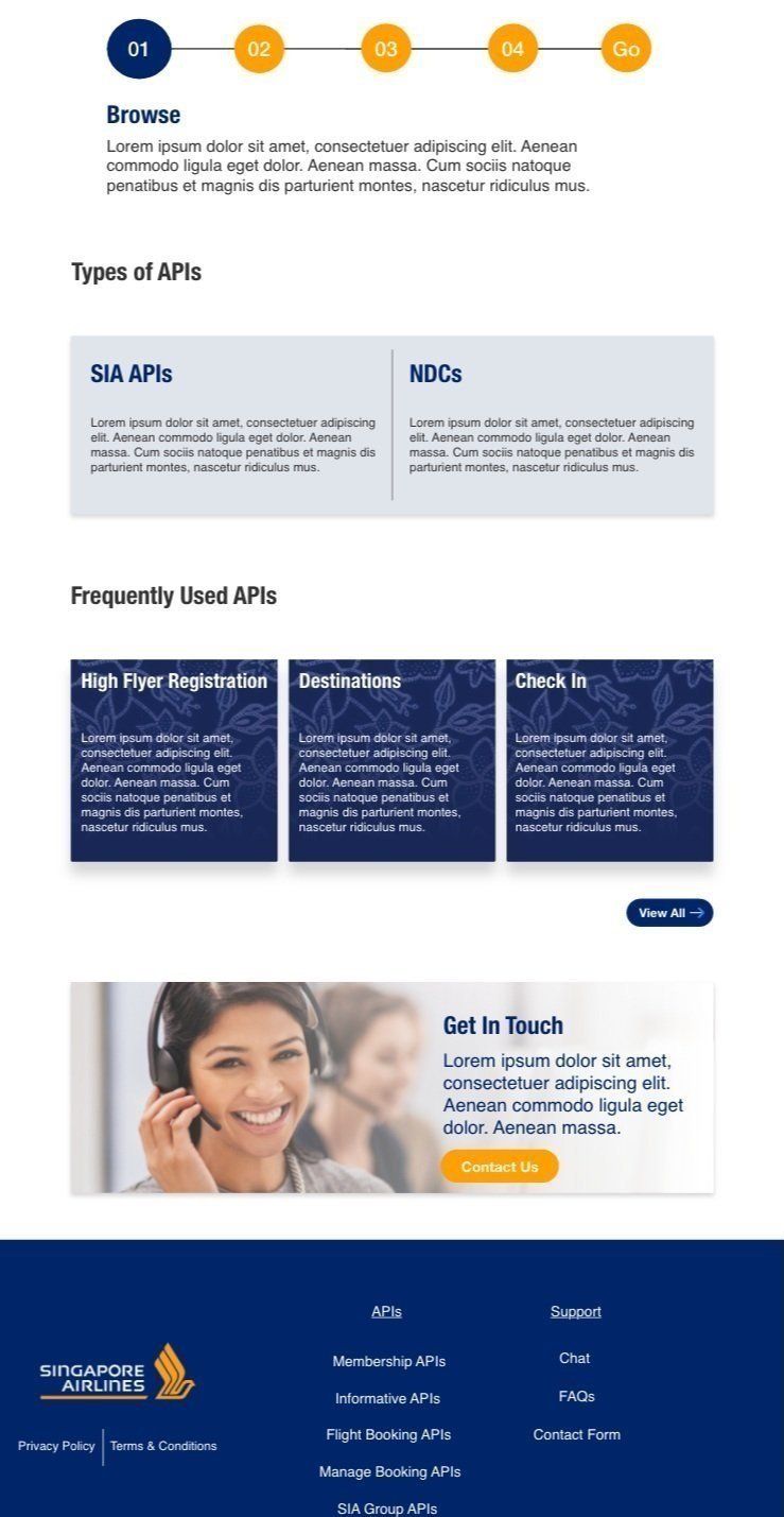
Once the sitemap had been approved by the stakeholders, I began wireframing. I wanted to make sure that the value of the product was made absolutely clear in the first few seconds of the user landing on the site, for which I included a list of benefits above the fold. Right under that, I included a select few partner stories so that users unfamiliar with the APIs had the chance to see how they have been utilized successfully by other businesses.
In order to put the actual product on display, I decided to introduce a carousel for the most popular/frequently used APIs based on the airline’s past analytics data. Since both categories of users reported that they were unsure of the procedure to take to gain access to the APIs, I thought it would be useful to include a very brief “Getting Started” guide, so that users are able to familiarize themselves with the steps that need to be taken to achieve their end goal before they dive in.
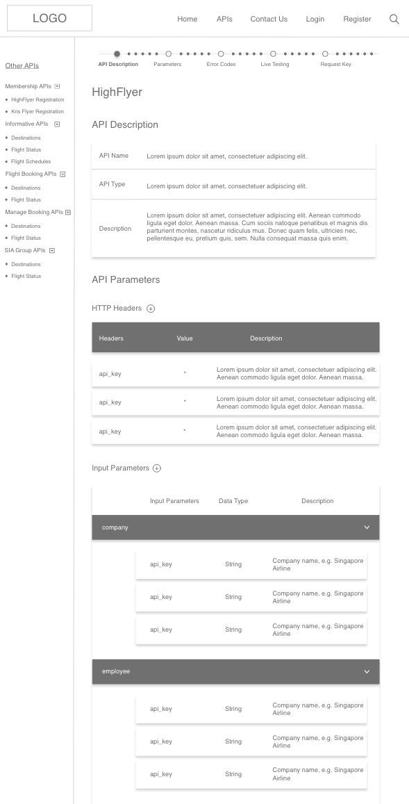
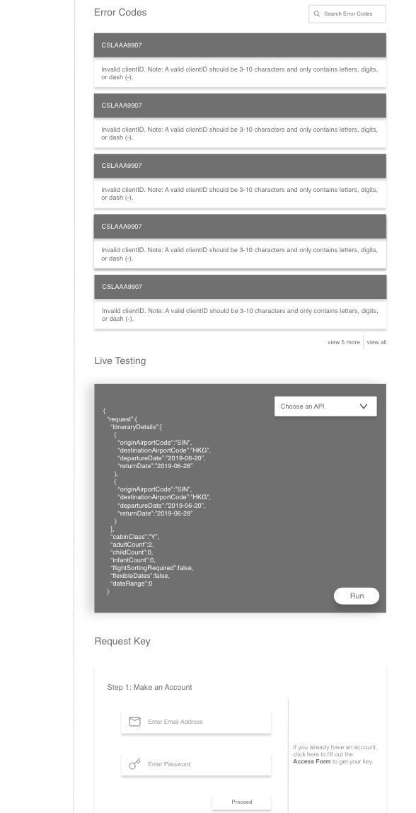
The other page that I designed was the specific API pages. In order to do away with the long scrolls and afford easy access to the different parts of the page, I introduced collapsible blocks and at the top of the page I introduced a fixed navigation bar with the section headers. And on the side, I had another menu to display the other types of APIs.

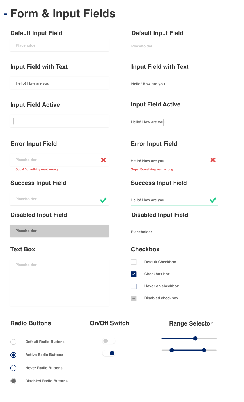
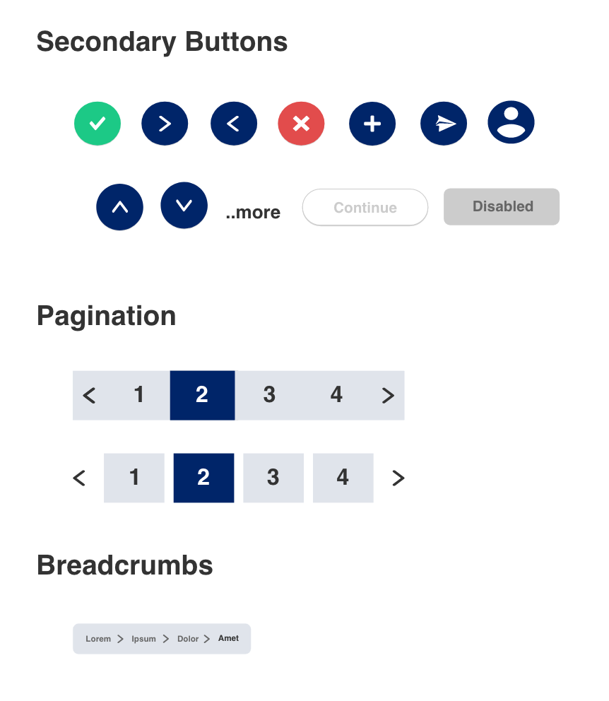
After receiving approval on the low-fidelity designs, I suggested the creation of a design system as the client wanted the look and feel of the API site to be aligned with the multitude of existing product and service websites that they had. I noticed that even though the font and brand colors were consistent throughout, there weren’t many other defining elements that they had used to establish their brand identity. I went ahead and tried to establish guidelines regarding components like buttons, content cards, navigation bars, iconography, form and input fields, etc.


After the design system was finalized, I started creating the high-fidelity mockup for the home page of the website.
Takeaways
I understood the importance of Information Architecture in affording a seamless experience, allowing users to find the information they need quickly and easily.
I learnt how to constructively take feedback from both team members and clients and justify my design decisions when required.
I also realized the importance of design systems in establishing a brand’s identity and increasing its recognizability across platforms.