Eldr Redesign
Scroll ↓
The Product
happyAging (hA) is a health and wellness platform catered towards people over the age of 50 as well as their caregivers and family. hA develops content in the form of articles & videos with the help of a panel of medical, financial and legal experts on a wide variety of topics like health conditions, mental health, lifestyle, palliative care, entertainment, technology and finance management. Aside from this, hA also fosters community building by organizing events and workshops for members and also hosts interest groups online to facilitate interactions among people.
The Problem
Even though there are very few platforms that exist that do the work that happyAging does on the scale that they do, they somehow struggled with high bounce rates and low retention rates. Looking at web analytics, we concluded that the landing page seemed to be doing a poor job in communicating the immense value that the site had to offer and on top of that, very few users were able to discern that the content being displayed were written and vetted by reliable sources in the concerned fields. Through the redesign, we wanted to make sure that within the first few seconds of opening the site, people could grasp the breadth of information that we had to offer and also understand that happyAgings sole purpose was to aid people through the later stages of life and enable them to live it to their fullest.
Responsibilities
Carrying out user interviews, creating empathy maps, conducting a competitive analysis, mapping out user journeys, constructing a site map, leading a rebranding effort, building wireframes and high fidelity mockups
My Role: UX Designer
Duration: 3 months
Software Used: Miro, Figma
Empathizing
Since it was quite obvious to us from the start that one of the main issues was user perception, I thought that it would be the most beneficial if I started off with user interviews in order to get to the root of the issue. I recruited a group of 5 people, between the ages of 50 and 75, a couple of whom had used happyAging before while the rest were unfamiliar with the website. I started off by asking them a few general questions about their daily routine and how they surf the internet
and the kind of content that they typically interact with. Then, I conducted a think-aloud session wherein I gave each participant a set of tasks to be performed on the website to see where the roadblocks occurred and where we were going amiss in terms of meeting user goals. From the results of this session, I created a cumulative persona as well as an empathy map in order to encapsulate the needs of the user and help in decision making later on in the redesign process.

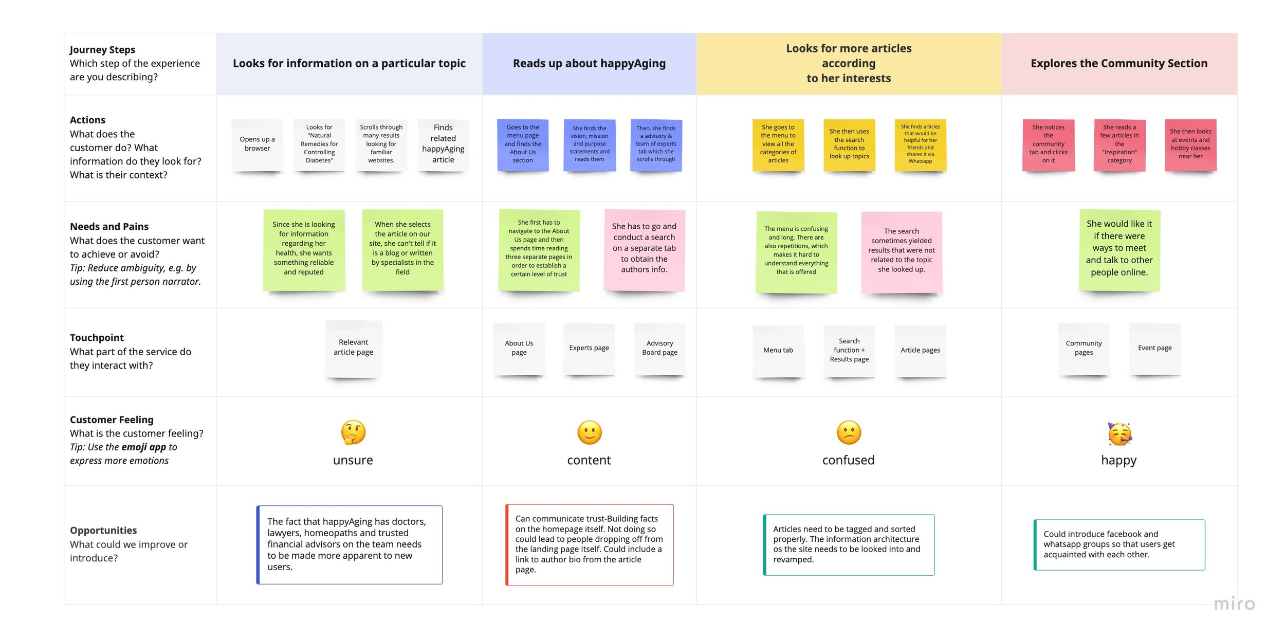
Finding the Happy Path
Since I was able to see the way in which some people use our site, it made it easy for me to create a journey map to summarize the interactions. The journey map helped me break down each action taken in the process into smaller steps which in turn enabled me to identify areas of improvement on specific pages of the website. This also allowed me to uncover potential roadblocks that could occur in the process.
Staking out the Competition
I wanted to make sure that I had a functioning understanding of the services that other companies in this niche had to offer and what they were or were not doing well. For this, I thought that a competitive analysis would be fitting.
I spent some time looking for brands in this category and found very few, which in itself spoke to the uniqueness of this product, especially in India. However, the few in existence focused their efforts entirely on dispelling the negative attitude and
positive connotation to it which was apparent through the UX writing on these websites. This was one of the most important findings from my study and I made a point to keep this in mind throughout the redesign.

Time for a New Look

After having completed the research piece, it started to seem as if the hesitation towards the company came from the way we portrayed ourselves to our audience. Since I wasn’t entirely sure whether this was in fact the case, I decided to send out a survey to a large number of people in the age bracket of our target audience (50+), more than half of whom had interacted with our site at least once before, and asked them to briefly look at our logo, homepage and about us pages and answer a few open ended questions like:
What comes to mind when you think of happyAging?
What of the following words do you think of when you think of hA?
What kind of feelings do you experience when you think of hA?
The response to these questions were unfavorable as most people reported that they associated the brand name with the idea of aging which was negatively spoken about in society and is often a cause of discrimination. This was in fact the opposite of what the team had intended to communicate through the naming, who said that they wanted to disrupt that ideology. This confirmed the need for the rebranding and I began to create a variety of logo options.
After having spoken to the team at happyAging, we narrowed it down to two potential names and logos and then created another survey to allow our users to make the final call. We had an overwhelming number of people prefer the name eldr over the other option eldrjoy and our original happyAging. Our respondents reported that the color-ways used in the new logos communicated a feeling of modernity and freshness. Most of the people who took the survey also said that they liked the word “eldr” because it is typically used respectfully and reverently in Indian society.

Cleaning up the Clutter
A couple things that were apparent from the research I had conducted was that; 1. People found the amount of information being displayed on the homepage overwhelming and 2. The organization of the articles and the menu did not lend itself to people understanding the extent of content the site has to offer. I felt that the second problem could only be tackled by rethinking the information architecture of the website. When I myself went through the menu, I found that there were categories that were repeated in different sections which made it unnecessarily long. I also took time to explore all the types of articles and videos on the site in order to sort them into buckets and then created a site map.

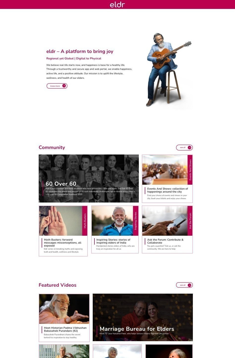
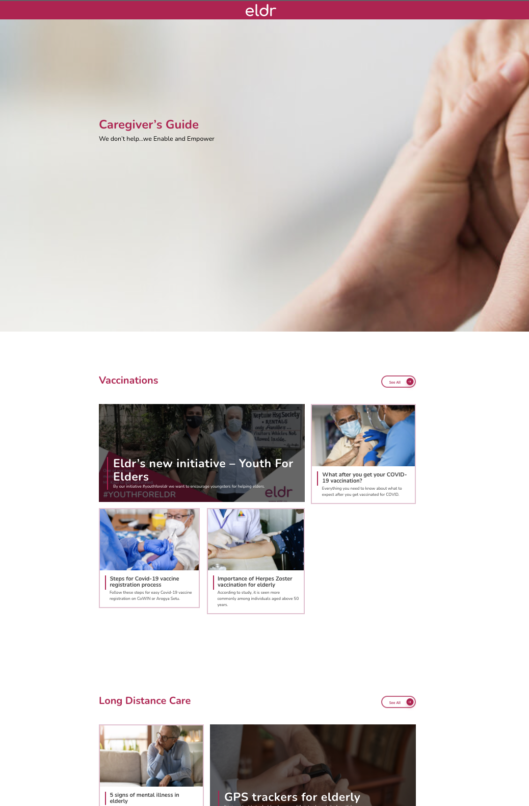
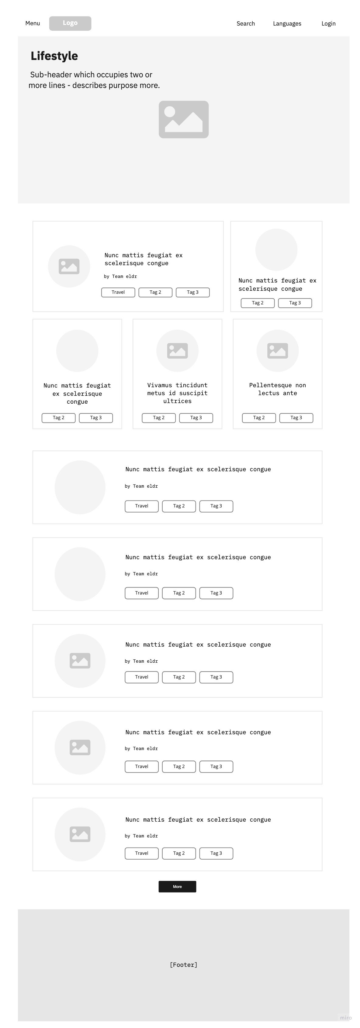
A Fresh Face
As I started work on the wireframes, I wanted to make sure that the site was consistent with the feelings that were induced by our new name: modernity and freshness. To do this, I started off by reorganizing the home page and creating clear, separated sections to display the content and since I wanted to make sure that the audience quickly became aware of exactly how much the website had to offer, I made sure that a majority of the space was taken up by articles and videos.


Final Sprint
Once the wireframes had been approved, I started to develop my high fidelity mockups. One major change that I implemented from the low-fi to hi-fi stage was the categorization of the home page. Instead of displaying articles based on popularity, trends and recommendations, I thought it would be more useful and consistent if they were grouped according to the buckets that were listed in the menu tab in order to communicate the vastness of the information available.
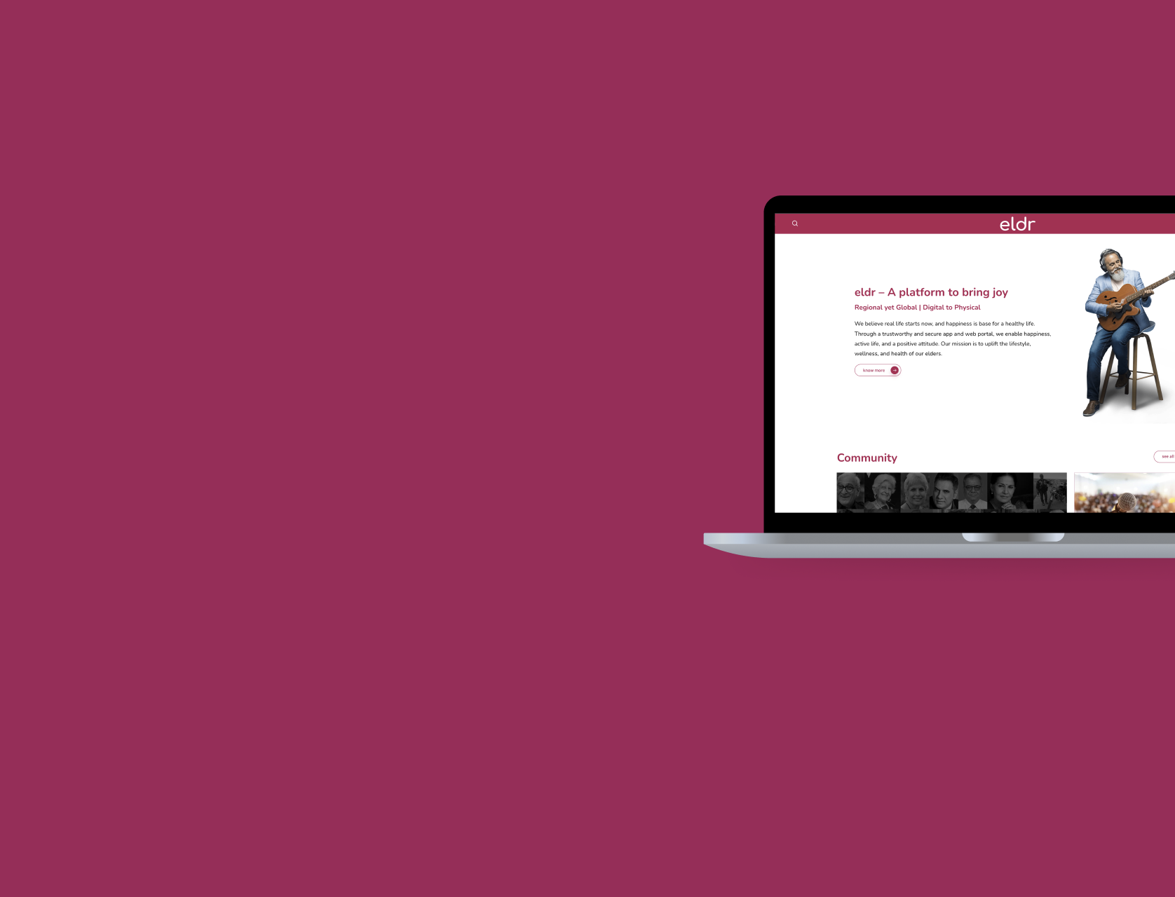
You can view the website at: eldr.co