

Industrial Vehicle HMI
Scroll ↓
The Problem
In early stages of our preliminary research, one thing was made strikingly clear to us; the displays that were being used by all industrial vehicle manufacturers were extremely outdated in not only their look and feel, but even in their functionality. Oftentimes users reported having to be trained to understand how to operate these displays. People found it difficult to make connections with the iconography used and had to scroll through long settings menus to find some of the
features. Not only this, but some of these screens were difficult to use in some environments due to a lack of brightness settings and limited contrast. Another facet of the problem was the long work hours and mundane, repetitive activities that workers had to engage in which often resulted in low productivity and sometimes even extended projects. The entertainment functionality of the display was introduced to keep users captivated and motivated throughout the day.
Responsibilities: User interviews, creating personas, defining problem statements, storyboarding, making sketches, conducting a usability study, and designing a mid-fidelity prototype.
My Role: UX Designer Software Used: Miro, Adobe XD Duration: 2 months
The Product
Verolt, which is a company with a HMI focus, wanted to create a display specifically for excavators and forklifts that will revolutionize the way that operators interact with their vehicles. They wanted to make a minimum viable product to showcase at an automobile trade show in Europe in 2021.
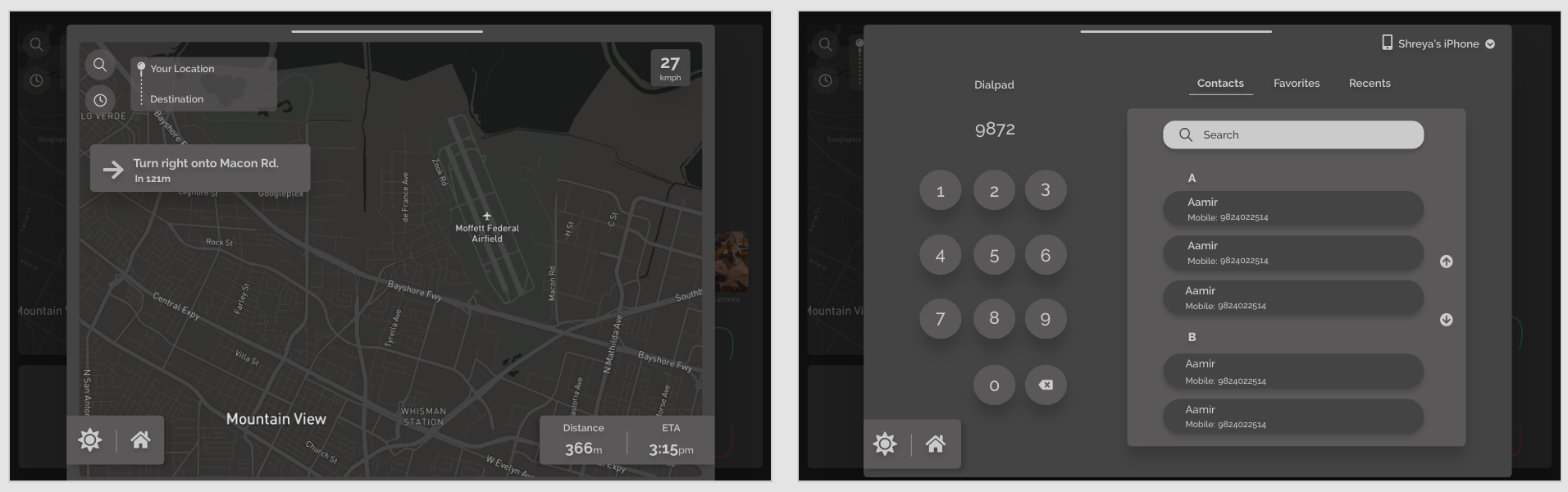
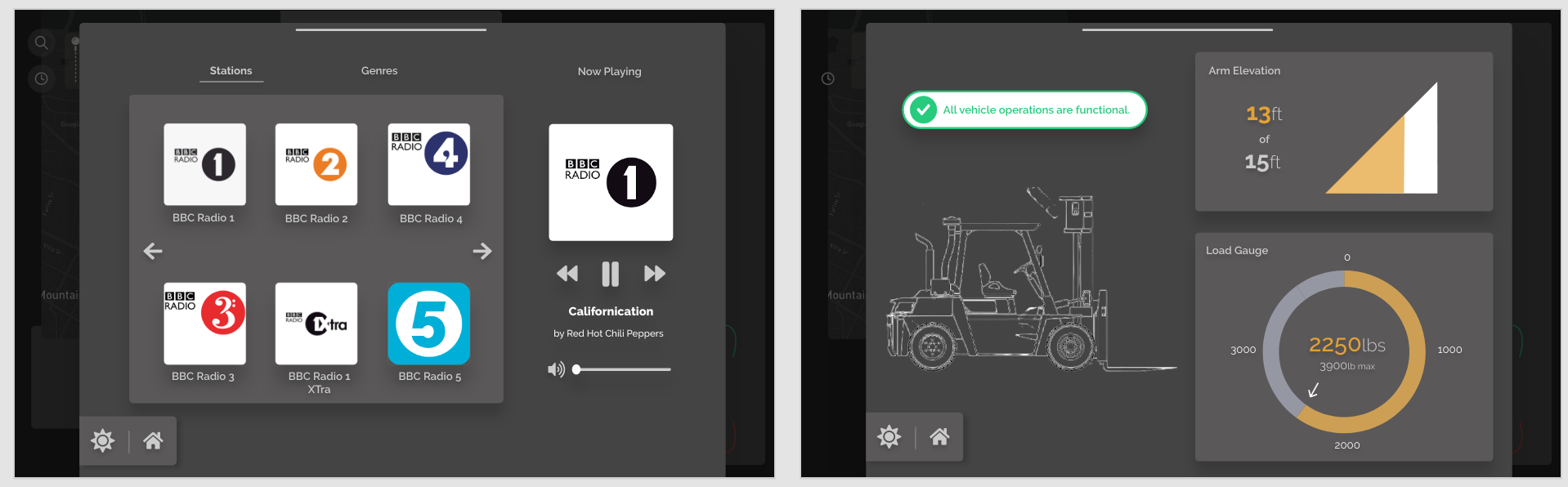
The team noticed the huge gap between present day car dashboards and anything that was on the market for industrial machinery and seized the opportunity to bridge it through an infotainment system with a focus on safety. Along with telephony, music and navigation features,
the interface also would have the capability to sync up with the vehicle to report malfunctions such as overheating, battery charging issues, faults in vehicle attachments and even give drivers the ability to view arm heights and loads to make sure that it does not get overloaded.
Identifying the Gaps
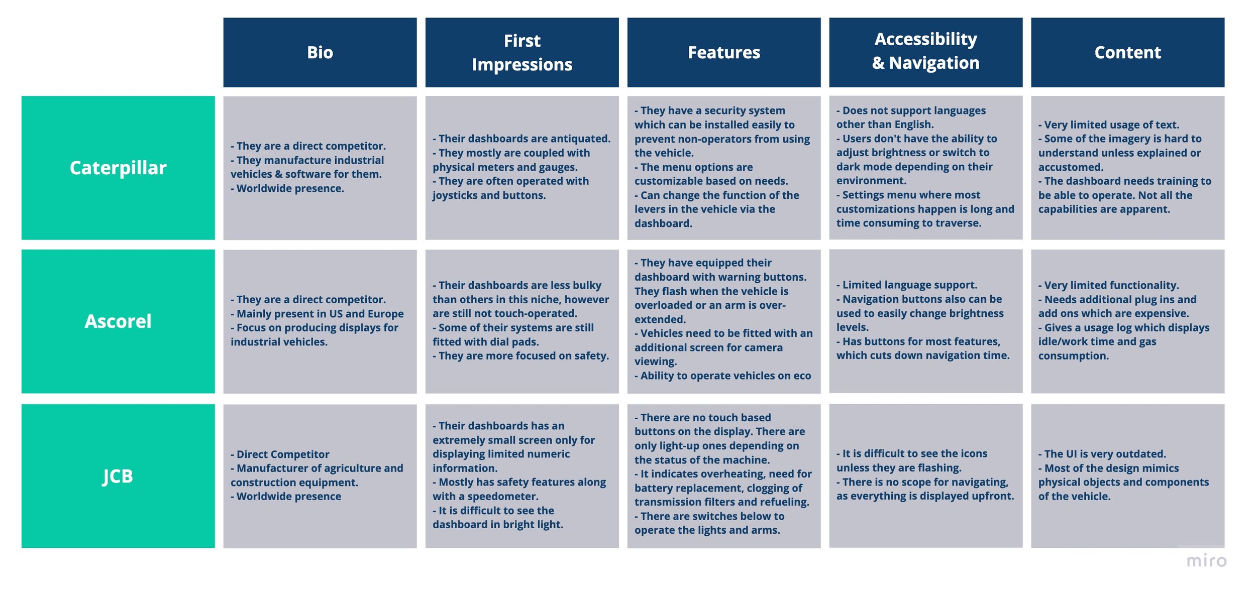
Since this was my first stint working in the automobile industry, specifically with industrial vehicles, I first undertook research to understand what kind of features these displays typically offered, what they looked like and their flaws and improvement areas. One of the first things I noticed was the displays were typically limited to 5 to 7 inches in width with thick bezels. Very few employed touch based interactivity and even ones that did, were coupled with physical buttons or joysticks for movement and selection.
They also mostly used dot-matrix displays which looked extremely outdated and more importantly, could not hold up when used in extremely bright environments and had limited features for accessibility. In terms of features, the displays were mostly focused on safety, security and proper functioning of the vehicle and its attached parts. Some also had auto-lock features to prevent unauthorized people from using up the machine and economy modes to lower fuel consumption when the controls were not in use for some time.
I also took to comparing indirect competitors like those in the automobile sector like Mercedes Benz, Volvo and Tesla, keeping in mind the difference in purpose.I thought that this was important to do as our aim was to make a product that blended the safety and functionality features that industrial vehicle displays offered and the informational, more entertainment oriented focus of these screens fitted in cars. From this research, I concluded that I would try to give my interface a clean, minimalist and modern look, aligned with what I was seeing in the car dashboards. After concluding my research, I summarized all of these pros and cons through my competitive analysis.
Empathizing with Users
Once I had a functioning understanding of what was available in the market, I decided that it was time to meet with the members of the target audience and figure out what their roadblocks, pain points and goals were. I identified two categories of users - the vehicle operator and the construction site manager who had slightly different motivations for interacting with the interface and interviewed one person belonging to each group.
Persona #1
When interviewing the construction site manager, she firstly mentioned that one of the most useful features that she has used was a job manager which she could access from her own computer as well which told her how much fuel was consumed by each vehicle, how long idle time was and how long the machines were running. The job manager also acted as a scheduler and gave her a breakdown of everyone’s shifts and duties which made her job of delegation much easier. She also mentioned that one of the biggest issues that she faced as a manager was keeping employee morale high. She admitted that as someone who used to be a construction worker herself, found it difficult to stay motivated while doing repetitive tasks that are part and parcel of the job. She reported that her workers often took longer breaks or started working slower as the day progressed which often pushed back project deadlines. She also mentioned that accidents were extremely common despite safety equipment and training. She stated that workers sometimes overloaded or overworked their machines which lead to damage to the vehicles and bodily harm.
Persona #2
The second person I interviewed was a construction worker who had been working in the industry for 8 years. I happened to notice some striking similarities in what they both reported. He mentioned that since he was the sole earner for his family of 4, he was paranoid about his safety as he knew a lot of friends and acquaintances who were put out of work due to avoidable injuries. He too said that it was hard to keep focus through the day and would appreciate some form of recreation. Additionally he mentioned that he would like a way to stay connected to his family as they were tight-knit and recently moved to the country and hence needed his support as they went about their day, especially his children who he spent very limited time with.


Bringing the Problems to Life
Once the interviews were completed and the personas were made, I moved on to storyboarding to predict a user's interaction with my product and try to see if it did solve the problems that they mentioned during the previous stage. I thought that this would also be useful for both stakeholders, to put themselves in the user’s shoes and help them empathize with them as well as me as the designer, to make sure that I remained unbiased and did not stray from the needs that were clearly articulated by the users.


Brainstorming
Since I had many ideas on how this problem could be solved and what the dashboard could look like, I thought it would be helpful to do a Crazy 8s exercise to pen down everything that I had in mind. I set a timer and drew out a handful of possible designs.
The first of my solutions was a touchless screen which would be operated by tracking user movements and gestures. The second design would have a stable dashboard on the upper half which would show the speedometer and a fuel gauge. The outline of the vehicle in the middle would indicate whether the arms and other attachments were functioning correctly. The lower half of the screen would have shortcuts to any three features of the user’s choosing and the entire display would be operated by a trackpad on the side of the screen. The third was a voice-operated display. The fourth through the seventh simply showed different arrangements icons and features and the last was a joystick operated dashboard.


Testing the Solution
I decided to conduct an in person usability test using my paper sketches to see which one user’s preferred and had less obstacles interacting with. The three interviewees were made to use the dashboard as they would if they were operating their vehicle and going about their work-day. A couple of things were made clear to me during this process and ultimately helped me choose the solution which would better serve the target group.
Finally, I went on to designing a medium fidelity prototype which included some of the possible typography and visual elements that would be included in the final product.

Next Steps
Implementation of a job board feature to keep track of scheduling and the usage of the vehicles.
Conduct a usability test on the medium fidelity prototype to find more improvement opportunities. Creating a high-fidelity prototype with finalized typography, imagery, etc.